Cycle button
User interface element
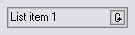
A cycle button or toggle button is a graphical control element that allows the user to choose one from a predefined set of options.[1] It is used as a button, the content of which changes with each click and cycles between two or more values;[1] the currently displayed value is the user's choice.
A cycle button's advantage over radio buttons or a list box is that it takes less screen space;[1] its advantage over a drop-down list is that a single mouse click is enough to switch between the two options. The disadvantage is if the button has many options, many clicks are needed to switch to the desired one. This is why some GUI environments have the ability to display the same element as a cycle button or a drop-down list, depending on the number of options.[citation needed]
References
- ^ a b c "Cycle button". Usability Glossary. Usability First. Retrieved 2011-06-25.
- v
- t
- e
Graphical control elements
- Adjustment handle
- Button
- Context menu
- Drop-down list
- Hamburger button
- Menu
- Pie menu
- Checkbox
- Color picker
- Combo box
- Cycle button
- Date picker
- Grid view
- Toggle switch
- List box
- List builder
- Radio button
- Scrollbar
- Search box
- Slider
- Spinner
- Text box
- Balloon help
- Head-up display in computing
- HUD in video games
- Icon
- Infobar
- Label
- Loading screen
- Progress indicator
- Sidebar
- Status bar
- Toast
- Tooltip
- Accordion
- Tree view
- Client-side decoration
- Disclosure widget
- Frame / Fieldset
- Menu bar
- Panel
- Popover
- Ribbon
- Tab
- Toolbar
- Window
- Workspace
This graphical user interface article is a stub. You can help Wikipedia by expanding it. |
- v
- t
- e


